Hamburg
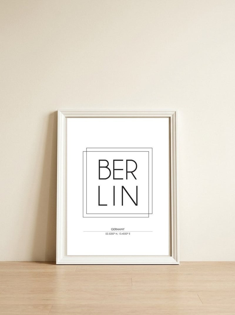
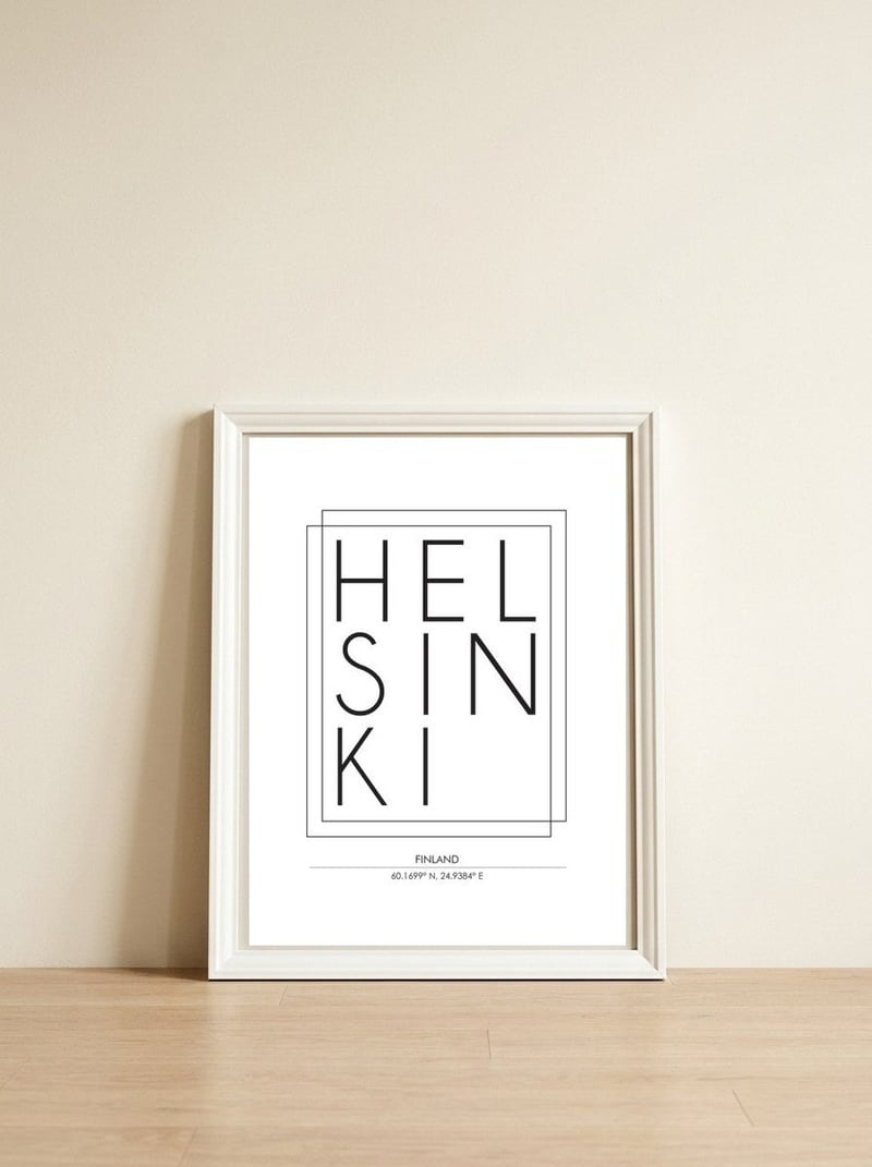
Studio GrafiikkaStudio Grafiikka approaches urban identity through the lens of professional graphic design, stripping a city down to its name and precise geographic coordinates. This piece presents Hamburg as a bold typographic anchor, balancing the weight of hand-drawn typeface design with the clean clarity of a map's data.

Hamburg
Studio Grafiikka approaches urban identity through the lens of professional graphic design, stripping a city down to its name and precise geographic coordinates. This piece presents Hamburg as a bold typographic anchor, balancing the weight of hand-drawn typeface design with the clean clarity of a map's data.
A meaningful share of this purchase goes directly to Studio Grafiikka.
Every Arthaus piece supports a living artist.
Art Analysis
A Typographic Anchor for the Port of Hamburg
The work centers on the name of the German port city, rendered in a style that bridges the gap between commercial advertising and personal travel memento. By utilizing sans serif typography styles, the artist creates a sense of structural depth, making the letters feel like architectural elements within the frame. The inclusion of coordinates grounds the abstract nature of the text, turning a simple word into a specific point on the globe.
There is a distinct pop art movement influence in how the piece treats everyday information as a focal point of beauty. The composition relies on the beauty of simplicity, using textural brushstrokes and professional graphic design principles to ensure the bold artwork feels both intentional and emotive. It captures the spirit of urban exploration without the need for literal imagery, allowing the typography to speak for the city's character.
The arrangement of the letters follows specific design principles to ensure the message is both legible and visually balanced.
The piece uses exact coordinates to anchor the city of Sydney in a specific physical and conceptual space.
This piece embraces a minimalist design philosophy, stripping the cityscape down to its essential shapes and earthy tones.
The bold lettering and layout reflect a pop art movement influence, treating urban signage as a high-design object.
Free Shipping
On all framed orders
100-Day Guarantee
Love it or return it
Gallery Quality
Museum-grade materials
Artist-Direct
Fair pay, every piece