Glasgow
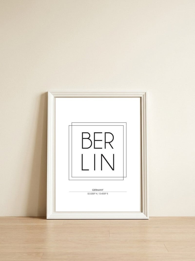
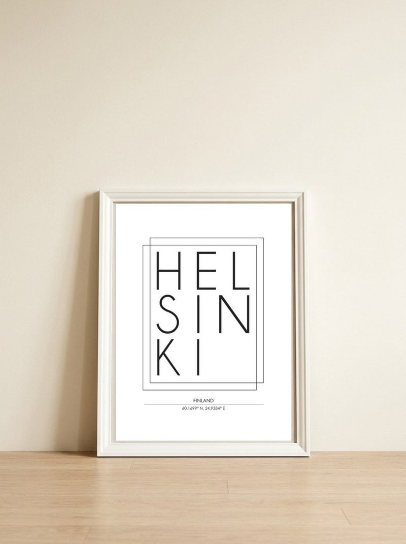
Studio GrafiikkaStudio Grafiikka constructs urban identity through the rhythmic weight of hand-drawn letterforms and the stark clarity of cartographic data. This composition captures the essence of Glasgow by balancing ornate typography with the clinical precision of geographic coordinates.

Glasgow
Studio Grafiikka constructs urban identity through the rhythmic weight of hand-drawn letterforms and the stark clarity of cartographic data. This composition captures the essence of Glasgow by balancing ornate typography with the clinical precision of geographic coordinates.
A meaningful share of this purchase goes directly to Studio Grafiikka.
Every Arthaus piece supports a living artist.
Art Analysis
The Rhythmic Geometry of Urban Coordinates
The piece centers on the name "Glasgow," rendered in a hand-drawn typeface that evokes the structural grit and architectural history of the city. By utilizing a monochrome palette, the artist emphasizes the geometric shapes of the characters, allowing the viewer to appreciate the negative space and the bold, graphic presence of the word itself.
Below the central text, the inclusion of specific coordinates introduces an element of mathematical art, grounding the expressive lettering in physical reality. This interplay between the fluid lines of the ornate typography and the rigid structure of the numbers creates a dynamic visual tension, reflecting the layered identity of a modern urban environment.
The artist uses intricate, custom-designed lettering to give the city's name a sense of weight and historical character.
The composition relies on the structural balance of lines and curves within the typeface to create a sense of architectural stability.
The piece uses coordinates to anchor the abstract graphic design to a specific point on the globe, blending art with cartography.
Free Shipping
On all framed orders
100-Day Guarantee
Love it or return it
Gallery Quality
Museum-grade materials
Artist-Direct
Fair pay, every piece