Amsterdam

Studio Grafiikka

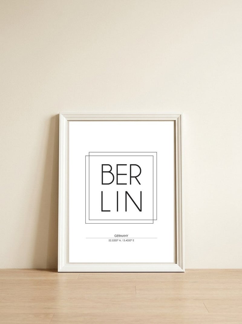
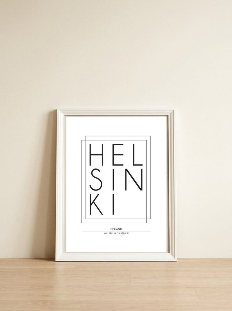
Studio Grafiikka distills the identity of a city into the sharp precision of typography and geographic coordinates. This print uses high-contrast black and white to turn the name of Amsterdam into a structural element that anchors a space with quiet, graphic authority.

Amsterdam — framed, leaning against the wall
Studio Grafiikka

Amsterdam

Studio Grafiikka distills the identity of a city into the sharp precision of typography and geographic coordinates. This print uses high-contrast black and white to turn the name of Amsterdam into a structural element that anchors a space with quiet, graphic authority.

Format
£64.99
Size
Frame Colour Black
Borders & Matting

A meaningful share of this purchase goes directly to Studio Grafiikka.

Every Arthaus piece supports a living artist.

Free shipping
100-day guarantee
Gallery quality
Secure packaging

Art Analysis

The geometry of a city captured through type

This piece utilizes a monochromatic color palette to emphasize the architecture of the alphabet. By removing the literal imagery of the city, the artist focuses on the balance between the bold weight of the text and the precise numbers of the coordinates. The spatial arrangement creates a rhythmic flow that guides the eye across the page, celebrating the city through its most basic linguistic and mathematical identifiers.

The work draws on visual communication techniques to bridge the gap between information and art. Through decorative typographic treatments, the name of the city becomes a symbol of travel and memory rather than just a label. It is a thoughtful exploration of how minimalist design can evoke a sense of place through intentionality and the stripping away of the unnecessary.

Free Shipping

On all framed orders

100-Day Guarantee

Love it or return it

Gallery Quality

Museum-grade materials

Artist-Direct

Fair pay, every piece

About the Artist

Studio Grafiikka

View Artist Profile