O Is For OCTOPUS
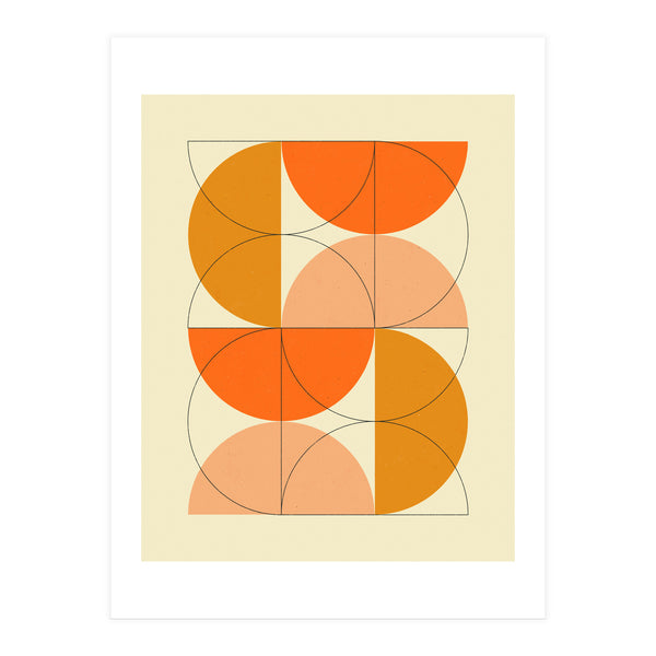
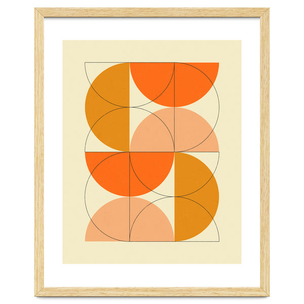
Jazzberry BlueJazzberry Blue builds a world of graphic clarity where letters and life forms merge into a singular, vibrant lesson. This piece uses bold geometry to introduce the octopus not just as a creature, but as a playful character defined by pure color and shape.

O Is For OCTOPUS
Jazzberry Blue builds a world of graphic clarity where letters and life forms merge into a singular, vibrant lesson. This piece uses bold geometry to introduce the octopus not just as a creature, but as a playful character defined by pure color and shape.
A meaningful share of this purchase goes directly to Jazzberry Blue.
Every Arthaus piece supports a living artist.
Art Analysis
A Bold Graphic Celebration of the Deep Sea Alphabet
Jazzberry Blue applies a bold graphic design approach to this educational illustration, stripping the octopus down to its most essential, pure shapes. The composition balances the letter 'O' with the fluid form of the cephalopod, using a vibrant color palette to engage young viewers and nurture creative minds. The result is a clear, high-contrast image that prioritizes visual impact and legibility for a children's space.
By blending oceanic marine life with a playful narrative, the artist creates an object character that feels both friendly and accessible. The work moves away from strict realism in art to celebrate the power of imagination, turning a simple alphabet entry into a celebration of life beneath the waves through structured, flat-color illustration.
Strong outlines and a deliberate use of space give the piece a poster-like quality reminiscent of travel promotional materials.
Abstract shapes and layered depths evoke the mysterious, moving environments found beneath the water's surface.
The artist constructs the animal's body from basic geometric building blocks, emphasizing structure over realism.
Free Shipping
On all framed orders
100-Day Guarantee
Love it or return it
Gallery Quality
Museum-grade materials
Artist-Direct
Fair pay, every piece
More to Discover
More from Jazzberry Blue
ArtistMore of Jazzberry Blue’s work, hand-picked from the collection.